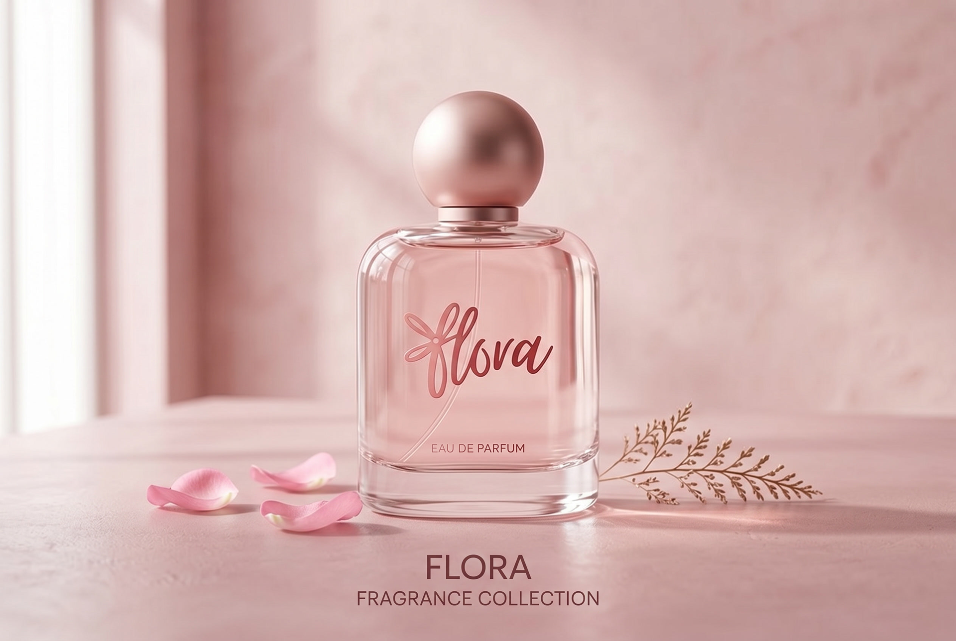
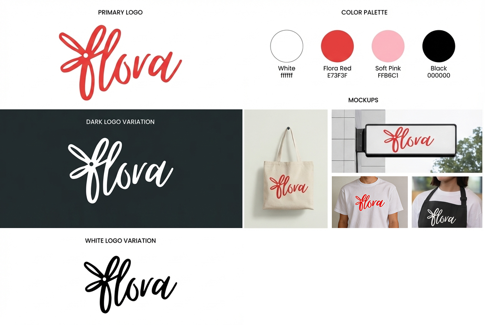
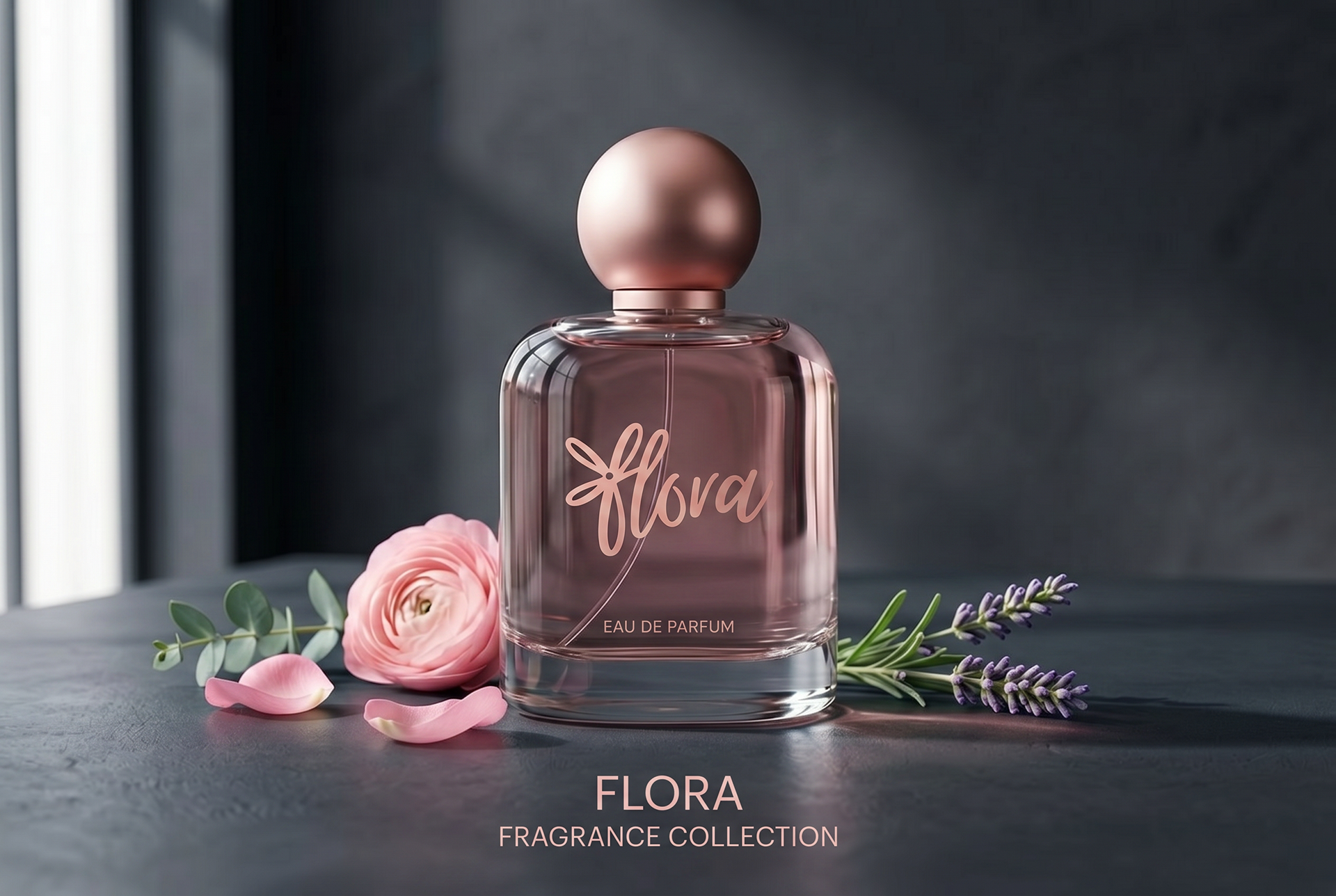
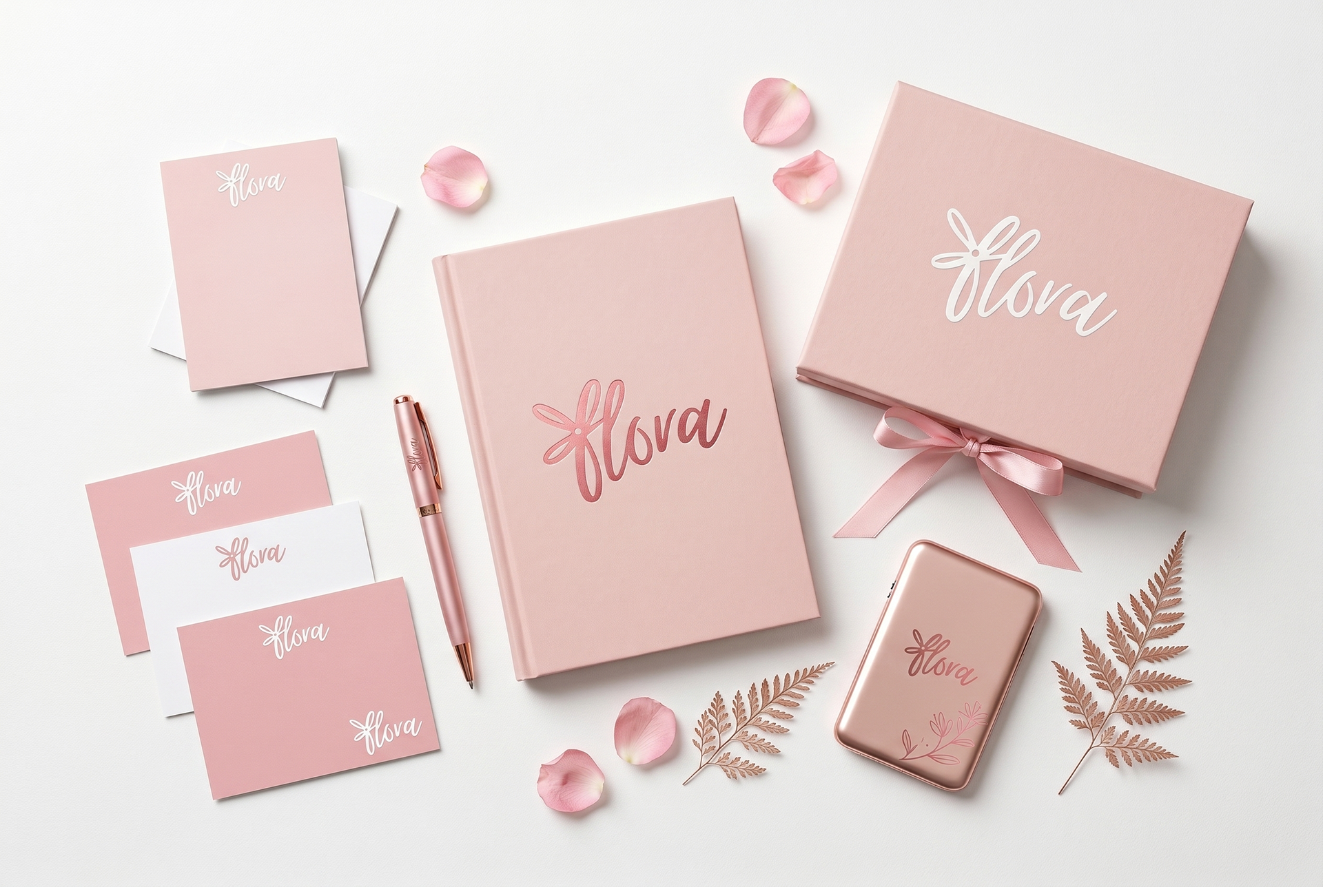
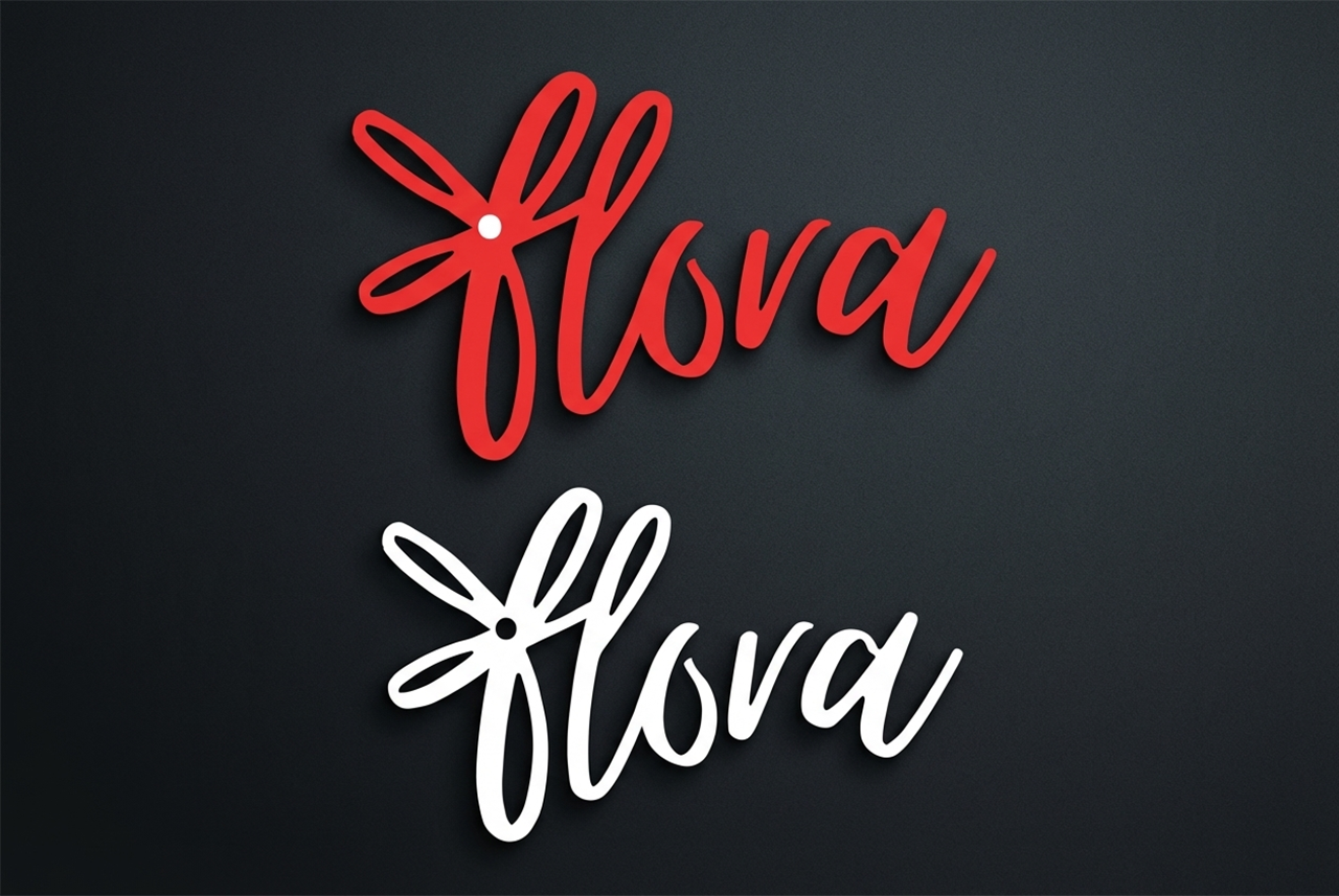
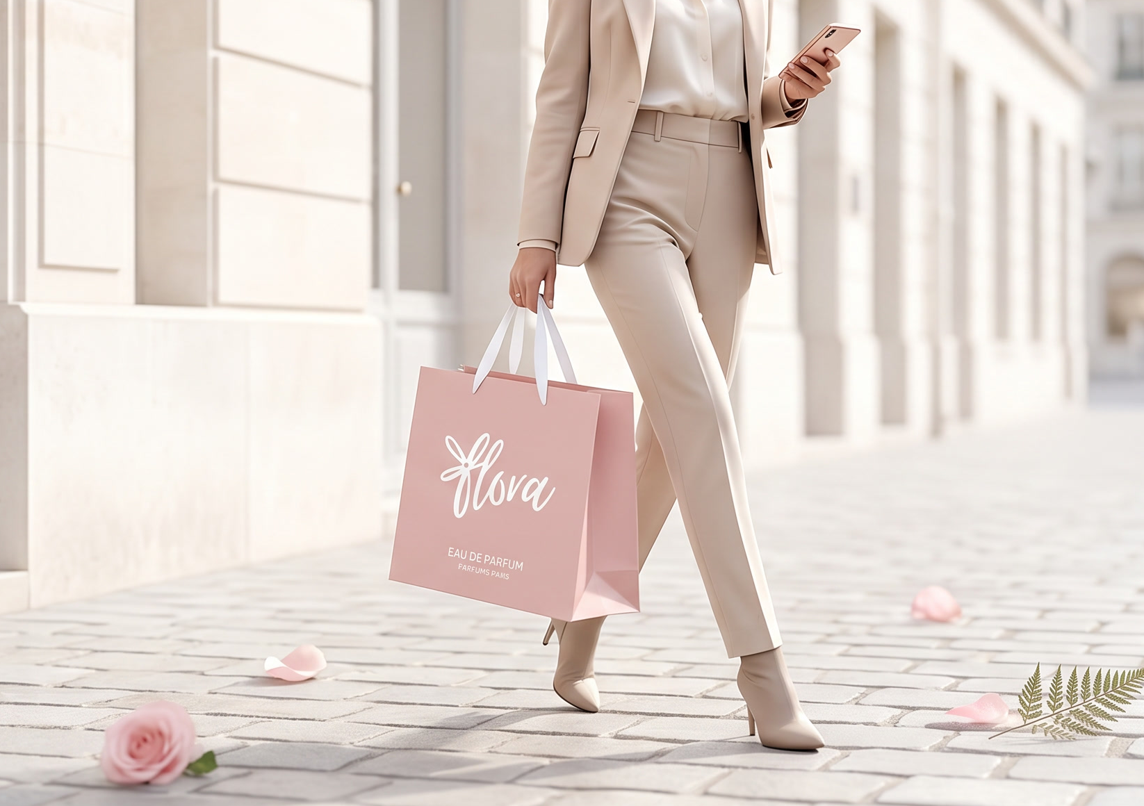
Flora is a celebration of natural beauty and feminine grace, embodied through thoughtful design choices that balance playfulness with sophistication. At the heart of the brand identity lies the signature flower icon—a delicate asterisk bloom that serves as both logo and symbol, representing growth, beauty, and the simple joy of fresh flowers. This floral motif isn't just decorative; it's the visual essence of what Flora stands for: bringing nature's elegance into everyday life.
The color palette draws inspiration directly from spring's first blush—soft pinks (#ffb3c1) that evoke cherry blossoms and tulips, bold reds (#ea3232) reminiscent of fresh roses, and pure whites that capture the innocence of daisies. These feminine, season-inspired hues create an atmosphere of warmth and approachability while maintaining the sophistication expected of a premium floral brand. The addition of black provides grounding contrast, ensuring the design never feels overly sweet but instead achieves a refined, editorial quality.
Minimalism guides every design decision. Clean lines, generous white space, and restrained typography allow the flowers—both literal and symbolic—to take center stage. The Dancing Script logo adds a handcrafted, personal touch without overwhelming, while Poppins provides clarity and modernity for all supporting text. This pairing reflects Flora's dual nature: artisanal care meets contemporary convenience. Rounded corners soften the interface, pill-shaped buttons feel approachable, and bordered elements create gentle structure without heaviness. The result is a design system that feels fresh, elegant, and effortlessly feminine—a digital garden where every detail blooms with intention.
Back to Top